WYSIWYG
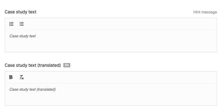
1Wysiwyg::make()2 ->name('case_study')3 ->toolbarOptions([ [ 'header' => [1, 2, false] ], 'ordered', 'bullet' ])4 ->maxLength(200)5 ->note('Some note') 1<x-twill::wysiwyg 2 name="case_study" 3 :label="twillTrans('Case study text')" 4 :placeholder="twillTrans('Case study placeholder')" 5 :maxlength="200" 6 :note="twillTrans('Help text')" 7/> 8 9<x-twill::wysiwyg10 name="case_study"11 :label="twillTrans('Case study text')"12 :toolbar-options="[ [ 'header' => [1, 2, false] ], 'ordered', 'bullet' ]"13 :placeholder="twillTrans('Case study placeholder')"14 :edit-source="true"15 :translated="true"16 :maxlength="200"17 :note="twillTrans('Help text')"18/> 1@formField('wysiwyg', [ 2 'name' => 'case_study', 3 'label' => 'Case study text', 4 'placeholder' => 'Case study text', 5 'maxlength' => 200, 6 'note' => 'Hint message', 7]) 8 9@formField('wysiwyg', [10 'name' => 'case_study',11 'label' => 'Case study text',12 'toolbarOptions' => [ [ 'header' => [1, 2, false] ] ],13 'placeholder' => 'Case study text',14 'maxlength' => 200,15 'editSource' => true,16 'note' => 'Hint message',17])By default, the WYSIWYG field is based on Tiptap.
You can configure the toolbar if needed.
For example, this configuration will render the default toolbar.
1@php 2$wysiwygOptions = [ 3 ['header' => [2, 3, 4, 5, 6, false]], 4 'bold', 5 'italic', 6 'underline', 7 'strike', 8 'blockquote', 9 'code-block',10 'ordered',11 'bullet',12 'hr',13 'code',14 'link',15 'clean',16 'table',17 'align',18];19@endphp20 21<x-twill::wysiwyg22 name="case_study"23 :label="twillTrans('Case study text')"24 :toolbar-options="$wysiwygOptions"25 :placeholder="twillTrans('Case study placeholder')"26 :edit-source="true"27 :maxlength="200"28 :note="twillTrans('Help text')"29/>| Option | Description | Type/values | Default value |
|---|---|---|---|
| name | Name of the field | string | |
| label | Label of the field | string | |
| type | Type of wysiwyg field | quill tiptap |
tiptap |
| toolbarOptions | Array of options/tools that will be displayed in the editor | See above | |
| editSource | Displays a button to view source code | boolean | false |
| hideCounter | Hide the character counter displayed at the bottom | boolean | false |
| limitHeight | Limit the editor height from growing beyond the viewport | boolean | false |
| translated | Defines if the field is translatable | boolean | false |
| maxlength | Max character count of the field | integer | |
| note | Hint message displayed above the field | string | |
| placeholder | Text displayed as a placeholder in the field | string | |
| required | Displays an indicator that this field is required A backend validation rule is required to prevent users from saving |
boolean | false |
| direction | Set custom input direction (from v3.1.0) |
ltr rtl auto |
auto |
Note that Quill outputs CSS classes in the HTML for certain toolbar modules (indent, font, align, etc.), and that the image module is not integrated with Twill's media library. It outputs the base64 representation of the uploaded image.
It is not a recommended way of using and storing images, prefer using one or multiple medias form fields or blocks fields for flexible content. This will give you greater control over your frontend output.
A migration to save a wysiwyg field would be:
1Schema::table('articles', function (Blueprint $table) { 2 ... 3 $table->text('case_study')->nullable(); 4 ... 5 6}); 7// OR 8Schema::table('article_translations', function (Blueprint $table) { 9 ...10 $table->text('case_study')->nullable();11 ...12});When used in a block, no migration is needed.
Advanced Tiptap usage
With the Tiptap wysiwyg editor you can access some additional features. Below is a more detailed explanation.
Link browser
When needed, you can let users browse internal content, this can be especially useful to maintain correct links inside wysiwyg editors.
This can currently only be done using the Form builder by adding browserModules to the
wysiwyg field:
1Wysiwyg::make()2 ->name('description')3 ->label('Description')4 ->translatable()5 ->browserModules([Page::class])Instead of taking the slug to the content during the time of writing the content, it let's you render the url during render time.
When selecting a piece of content it will link it as such: href="#twillInternalLink::App\Models\Page#1"
This will then be replaced during render time if you are using the $block->wysiwyg('field') or $block->translatedWysiwyg('field') helpers.
You can customize the url by implementing the getFullUrl method on your model class.
For regular fields on models you will have to manually call parseInternalLinks like this:
1{{ \A17\Twill\Facades\TwillUtil::parseInternalLinks($item->description) }}Link style
If needed, you can let users add specific classes to links, which can be especially useful to create CTA or similar button-like hyperlinks that are styled differently than regular links.
This can currently only be done using the Form builder by adding classList to the
wysiwyg field:
1Wysiwyg::make()2 ->name('description')3 ->label('Description')4 ->translatable()5 ->classList(['btn' => 'Show this link as button'])Manually setting input direction
Introduced in v3.1.0
For certain types of input it maybe useful to manually set the direction to left-to-right (ltr) or right-to-left (rtl) depending upon the expected text input; for example you may need a single Hebrew text entry in an otherwise ltr form.